This is a poster I made for my preliminary video and also as an exercise to practise using Photoshop. Here in this poster I used 12 layers. The background was orange and the caution sign and the old paper texture given below were merged in with the background.
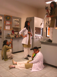
For the third, forth and fifth layers I used the photos of students. The photographs are shown below.

The picture of the flask was taken from here.
I erased the background from the photographs by using the magic selection tool and also the hand erasing tool. Then, I smudged the edges with the smudge tool so that the drawing looked more neat and natural. The opacity of the picture of the flask was reduced so that it would look more realistic. For the text, I used different layers. The fonts I used were Hobo STD, Tahoma and Verdana. From the blending options I used inner and outer glow option for the heading to give it more body and a stroke to all the text so that the captions stand out on the poster. The face of the Principal was taken from the video of the preliminary exercise.
Mainly blending was done here and the color compositions of the characters were brightened with +33 brightness and +5 contrast.


No comments:
Post a Comment