Sunday, February 6, 2011

Our movie budget and list of softwares used.


S.No
List OF requirements
Cost per object
Number of objects
Total cost/Rs
Use
1
Mini  DV
300
2
600
For the Handycam
2
DVD  - R
100
1
100
To keep backup of final and preliminary video
3
Photocopy of Questionnaire
2
250
500
For the questionnaire’s to be distributed amongst the students


Total Cost


1200


List of equipments and software’s used
Adobe after effects CS4
Sony Vegas Pro 9.0
Adobe Premier CS4
Adobe Photoshop
Adobe Illustrator
Canon cyber shot camera
Tripod
JVC handy cam SD
Garage band
 Xilisoft Media converter


Saturday, February 5, 2011

Analysis of movie (genre:drama) 3


Camera angle, movement and shots.
The movie begins with the close up of the main character waking up. The shots used through the sequence are closeups, mid shots, long shots and high angle shots and wide shots are used. also a point of view shot is shown in the very beginning when the subject looks at the window after waking up. Camera  movements are shaky and handheld. A rule of third is also followed when the subject wakes up, keeping his face in the center and on the top of the frame. Mid shots are used when the protagonist he looks at  the dent of his car. A closeup of a thank you note is also shown which the protagonist writes to be sarcastic.

Another point of view shot used of the people sitting inside the train looking out of the window. The camera moves and stops as the train stops, keeping the protagonist in the middle of a frame. A wide shot is used here. A long shot of him running is shown when he realizes that he is on a wrong platform. Panning is shown when he is seated inside the train and looks out the window. High angle shots are also shown of the protagonist running over the bridge to reach to the other side of the platform. Focus pulls are also used at some places

Editing:
Action match and graphic match is shown throughout the sequence. The opening title show a morning routine of one person with no other inserts of other shots. In many places long takes are used. No transition effects are used and the editing here is quite simple. However in the first part of the sequence, there seems to be a blue filter on the shots that make the appearance dull and thus connotes gloominess and loneliness.

Sound:
We hear a diegetic music that woke the subject up and also a non diegetic music played very softly in the background. This shows that the situation is very serious and depressing.We also hear the voice over of the subject and no dialogues are used in this opening sequence. The slow music starts when he looks at the window.

Mise en scene:

The movie starts in the dark apartment of the protagonist showing less space and a sofa which can be converted into the bed. The location emphasizes the gloominess The room has the basic furnitures The attire the protagonist is wearing looks kind of disheveled along with his appearance which shows that he doesn't really cares about how he looks and his life is passing through a complicated phrase.

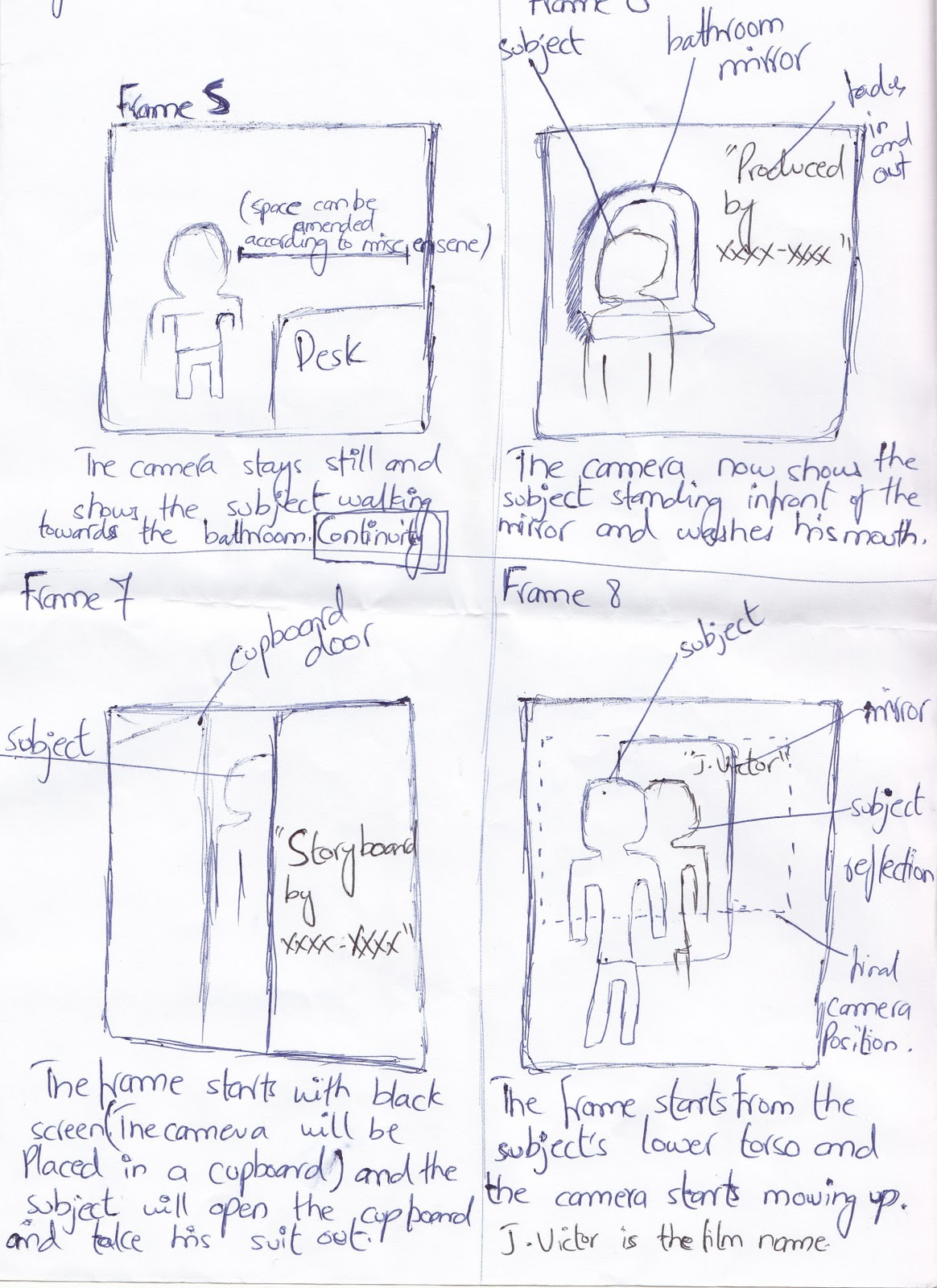
Storyboard of Journey to Hammad


Above is the storyboard of our movie Journey to Hammad. 

Poster made with Photoshop

On the Left side is the poster which I made for the documentary on media studies.This has been made in adobe Photoshop. In this poster I have used non-copyright images from http://www.sxc.hu/. After removing their background and other unnecessary elements using magic tool, I repositioned them on the page. The size of the canvas is 900x1300. All pictures were desaturated and a slight purplish color was given to the lights. Than I added the text and used spotlight effect form render tools. This is how the  final poster looks like. 

Location finalized

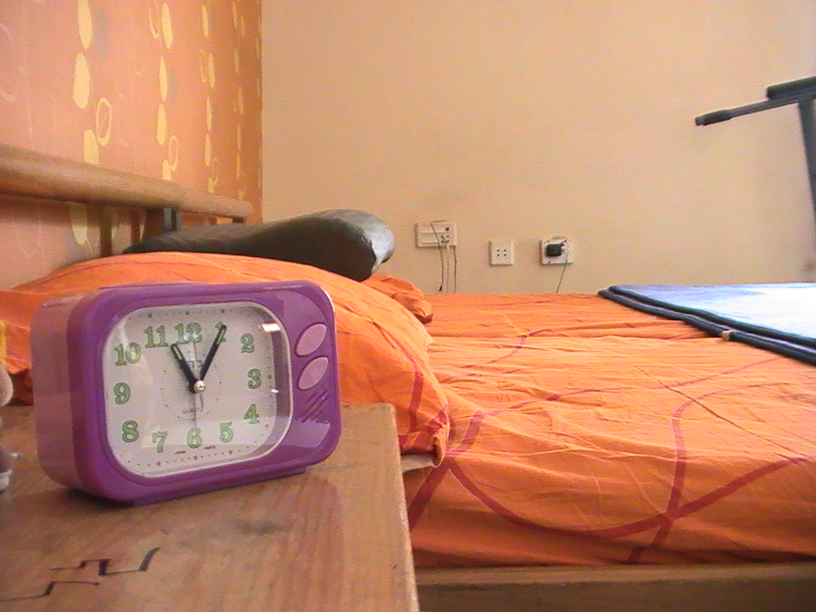
Despite the diatance issue, we decided that Arif's House will be more suitable for the shooting as his Decor and the arrangement of his room is more suitable for the movie we are about to make


This is the room we used to shoot the experimental opening title of a comedy and suspense genre. 

Below are the shots of the location we used for our final movie. 

We show the protagonist waking up and moving about to get ready for an unpleasant day. we make the mis en scene gloomy by by using window lights and shadows. We chose this room as it seems more masculine and there is adequate space to connote loneliness and failure due to less furnitures.


Institution changed: BBC production


Since our movie is more simple and is made to attract teenager and middle aged audience, we thought that BBC films will be more appropriate institution for our final movie. Most of the movies made by BBC films have been more meaningful and generally convey a message and represent more realistic matters in the society to educate and at the same time entertain its potential audience.

http://www.britannica.com/EBchecked/topic/79946/British-Broadcasting-Corporation-BBC

Below are the samples of the two Logos that we can use in our opening titles


Logo of our final movie


To make the opening title look more original, we made our own production house name. Constructing a logo was equally essential. After doodling and drawings one of our team mate Arif came up with an idea of making a square logo. Four sides and edges represented all the four team members in our group.

From the basic shapes in Adobe Illustrator, to adding filters and blending colors in it, this was the final shape we chose. The four different colors merging into each other show our individual  and completely different perspectives and thoughts combine together to form an even better and reformed idea and all the lines linked symbolize the unity in our group. . 
The name of our production house is AFAS. This name was made using the innitials of our names where S stands for Sama, F stands for Fatmah and two A's stand for Arif and Arika that is my name.

Than we came up with an idea of making this logo tumbling on to the screen and than the name of our production house appearing. This was achieved on after effects where we made this shape rotate on to screen and than stopping in  the middle Than the name of our production house appears just after the shape stops using Fade effect on the text. We plan to add sound effects on this logo too. The duration of this clip is 5 seconds. To make it look more professional, we used a lens flare effect moving on two sides forming an L. This showed that the logo shines after stopping due to the light.